
Building a responsive Navigation Bar Using CSS and Vanilla Javascript


When rendering a web page on different screen sizes, distortions and irregularities may be present. To avoid these issues, there is a need for a responsive design. Bootstrap, a CSS framework ,is a popular option for adding responsiveness to the page, but also has some drawbacks. It is bulky, hard to read sometimes, and not easy to customize.
This article describes how to create a responsive navigation bar using HTML, CSS, and Javascript. To carry out this process; basic knowledge of HTML, CSS and Javascript is required.
The code required to create the responsive navbar is divided into three for the HTML, CSS, and Javascript respectively.
HTML CODE The structure of the HTML code is explained below:
- The tag that contains the navbar is the header tag. The header has two class names -flex and row- with respect to the CSS to be applied.
- Within the Header Tag is the nav tag, true to the semantics of the name, it would be the nav bar described in this article. It has an id of “nav”, and like the header tag, it has two class names, flex and row.
- Inside the 'nav' tag are two elements - a div with an id of “nav-icon” and a ul(Unordered list) tag with two classes of "flex" and "row." The div with the id of “nav-icon” contains three empty divs. These empty divs would be styled to be a hamburger icon. The ul contains list tags(li), each with an embedded link. The list tags would be styled to be the navigation links.
HTML Codes
  <!DOCTYPE html>
<html lang="en">

<head>
    <meta charset="UTF-8">
    <meta name="viewport" content="width=device-width, initial-scale=1.0,maximum-scale=1.0, user-scalable=no">
    <meta http-equiv="X-UA-Compatible" content="ie=edge">
    <title>Efico</title>
    <link rel="stylesheet" href="./style.css">
</head>

<body>
<header class="flex row">

            <nav id="nav" class="flex row">


                 <div id="nav-icon">
                            <div></div>
                            <div></div>
                            <div></div>
                </div>
                <ul class="flex row">
                    <li>
                        <a href="./index.html">home</a>
                    </li>
                    <li>
                        <a href="./about.html">about</a>
                    </li>
                    <li>
                        <a href="./contact.html">contact us</a>
                    </li>
                    <li>
                        <a href="./service.html">services</a>
                    </li>
                    <li>
                        <a href="./news.html">news</a>
                    </li>
                    <li>
                        <a href="./faqs.html">faqs</a>
                    </li>
                </ul>
            </nav>
        </header>


    <script src="./script.js"></script>

</body>
</html>
CSS Codes
li {
    list-style-type: none;
}
.flex {
    display: flex;
}

.row {
    flex-direction: row;
}

body {
    overflow-x: hidden;
}
header {
    padding: 0 30px 0 52px;
    justify-content: space-between;
    align-items: flex-start;
    height: 110px;
}

nav {
    height: inherit;
    width: 50%;
}
nav ul {
    width: 100%;
   height: inherit;
   align-items: center;
   justify-content: space-between;
}

nav a {
    font-size: 18px;
    text-decoration: none;
    text-transform: uppercase;
    color:white;
    white-space: nowrap;
}
For smaller screens
@media only screen and (max-width:400px) {
    nav ul.flex.row {
        padding-top: 80px;
        z-index: 2;
        justify-content: flex-start;
        background: #3C185B;
        position: absolute;
        left: 0;
        top: 0;
        width: 100vw;
        min-height: 110vh;
        flex-direction: column;
        overflow: hidden;
        transition-duration: 300ms;
        transform: translateX(-100%);
    }
    nav.open ul.flex.row {
        transform: translateX(0);
    }
    nav {
        width: fit-content;
    }
    nav ul.flex.row li {
        margin-bottom: 40px;
    }
    #nav-icon {
        position: relative;
        z-index: 4;
        margin-top: 25px;
        width: 35px;
        height: fit-content;
        cursor: pointer;
    }
    #nav-icon div {
        border-radius: 2px;
        height: 3px;
        width: 35px;
        margin-bottom: 10px;
        background-color: white;
        transition-duration: 300ms;
    }
 /*

nth-child() is a pseudo-class matches elements based on their position in a group of siblings. Siblings are elements that are held in a parent section like the divs.

*/


    #nav-icon div:nth-child(3) {
        margin-bottom: 0;
 color: black;

    }

/* The rotate() CSS function defines a transformation that rotates an element around the x, y and z-axis without deforming it. */


    .open #nav-icon div:nth-child(1){
      transform: rotateZ(-45deg) translateX(-8px)translateY(10px);
 color: black;
    }

/* The default colour of the hamburger icon is white but you can add any color */

    .open #nav-icon div:nth-child(2) {
        opacity: 0;


    }
/* The class of open is from the javascript code */

    .open #nav-icon div:nth-child(3){
    transform: rotateZ(45deg) translateX(-8px)translateY(-10px);
  }
Javascript Codes
Note: The script tag should be embedded in the body
/* In the HTML tag, the div tag has an id of “nav-icon” */
var icon = document.getElementById("nav-icon");


/* In the html tag, the nav tag has an id of “nav” */

var nav = document.getElementById("nav");

/* Since we have defined the variable “icon” we add event listener for the  click */

icon.addEventListener("click", function(){

/* creates a toggle of when clicked it opens and closes */

nav.classList.toggle("open")
})
Results
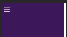
The Hamburger icon
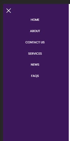
The responsive navbar with the cross icon and the nav elements.
You can reach out to me on twitter if you encounter any challenge: twitter.com/HeritageAlabi1
For more tutorials on pseudo-class elements, you can visit developer.mozilla.org/en-US/docs/Web/CSS/:n..