

A while ago, I was working on a dashboard for a football website and needed to create some special shapes. I could not make them easily by altering the CSS box-model properties, so I resorted to Google. I discovered that it is possible to clip a shape to get the desired component.
I stumbled on a site that could give my desired shape by playing with the axis. This article explains terms you need to understand before using the Clippy Art site.
CSS Clip-path is a property that defines the particular portion of an SVG image or shapes, such that the part of the image or shape inside the area is shown and part of the image outside the section is hidden.
SVG ( Scalable Vector Graphic) image is a vector-based graphics for the web. It has to be loaded with the Internet to preview the content.
Structure of Clip path
Basic-shapes: It includes some shapes like circle, rectangle, ellipse, etc that clips the available shape.
None: It includes no clipping.
Clip-source: The region to be clipped is taken from another HTML element. It can either be an image or empty div with a class or an Id.
How it works
Assuming we have a basic shape - inset:
img{
Clip-path:inset (top, right, bottom, left);
}
In the above code block, there should be values that indicate the top, right, bottom, and left positions respectively. These values will affect the clipped area.
The basic shapes

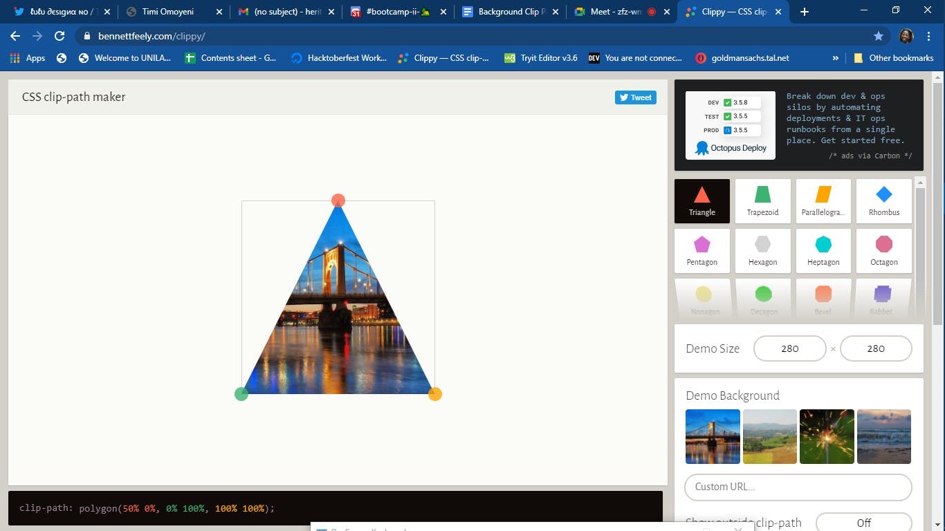
Polygon is the most flexible of all the available shapes because it allows you to specify any amount of points. The provided points are pairs of X and Y coordinates just like we plot values on our graph sheet.
img{
clip-path: polygon(50% 0%, 0% 100%, 100% 100%);
}

Circles are defined with this syntax: circle(radius at posX posY
img{
clip-path: circle(50% at 50% 50%);
}

Ellipses are defined using this syntax: ellipse(radiusX radiusY at posX posY)
img{
 clip-path: ellipse(50% 65% at 70% 50%);
}

Inset can define an inner rectangle and everything outside will be cut-out. It enables it to effectively crop an image or an element directly in the browser. You can also make the edges of the rectangle rounded by giving it a border-radius value and adding with the round keyword to your code block.
img{
 clip-path: inset(45% 0% 33% 10% round 10px);
}
The above points are highlighted to give you an idea of how the code block will look like and what the clipping path is. The site I discovered that takes care of the clip-path region is Clippy. You just have to play with the axis, get your desired shape, and copy the code snippet.
Image of Clippy site here
Check out Clippy from the link above
References:
Introduction to Clipping Using clip-path in CSS | DigitalOcean
https://www.digitalocean.com/community/tutorials/css-clipping-with-clip-path