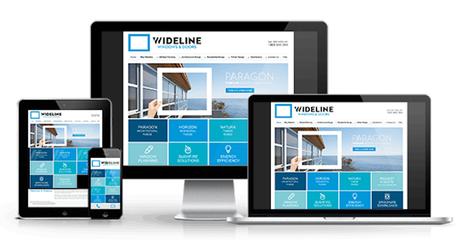


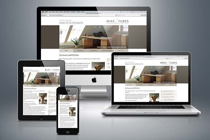
As newbies to frontend development, we find the aspect of responsiveness very challenging. We often write code on a laptop device and these devices have a relatively large screen size. We complete our webpage previewing it on this "desktop screen” and the layout looks proper, we're excited. Then we view it on a mobile screen and the output most times isn't what we pictured in mind, it can make us feel disappointed and maybe discouraged not to showcase our works. I have struggled with responsiveness for so long it became scary to try. I could learn a framework that makes it easier, but as a frontend developer, I believe it's best to learn how to do it with plain CSS first.
Why do we make websites responsive?
Responsiveness enables the site to look good irrespective of the device screen size.
Responsive websites will perform better in search rankings because they provide a better user experience than sites that are not mobile-friendly.
In frontend development, a web page is structured such that there are different components for different layouts, you have the menu bar, the various sections, and the footer. We say a site is responsive when it fits in no matter the screen size. The common screens are tablets, laptops, and smaller phones. Having contents fit in on the three devices fulfills the law of responsiveness.
Common Challenges We Face During The Mobile View Design
Navigation bar: This houses all the menu components that will take the user from page to page when clicked. Making the nav region collapse on mobile view could seem like an arduous task. As newbies, it is good to learn how to make it work with pure CSS and JS. I wrote an article on it
Images: Web pages aren't complete without images, They can be inserted through the HTML or set as background in the CSS. Whenever we have images displayed on the desktop view and want to produce on mobile; they may appear too big or stretched. That is why we assign max-width:100% to maintain its shape. Setting it as a background, we can assign background-size: cover, and give it a height in vh. For example;
section{
    background: url(./images/bg-desktop.svg);
    background-size: cover;
    background-repeat: no-repeat;
max-width:100%;
height:auto;
/* if you need the image to be longer */
height: 50vh;
or
min-height: 45vh;
}
then Image
.clock{
max-width:100%;
width:400px;
}
/* max-width of 100% scales the image to horizontally fit its parent container, preventing the image from being cut-off (horizontally) by it, no matter the width assigned to it, the image cant extend beyond its parent container. */
- Overflow: This is where there is horizontal scrolling on a device. It is as a result of contents exceeding the width of 100%. Multiple background images or color: We may not have them displayed fully on the device. To hide overflow, you can set it to;
body{
overflow-x: hidden;    /* hides excess spaces horizontally */

/* you can just set it to */
overflow:hidden;
- Uneven positioning: This is when elements(such as images, text, etc) are not aligned properly. On mobile, items are to be displayed at the center of every screen.
Important Tips You Should Note about Frontend Development
The fixed width of every device is 100% unless stated otherwise in the design, anything you want to arrange shouldn't be more than 100% otherwise, an overflow would occur
For a site to be responsive, media queries do the trick. Media-queries is a feature of CSS 3 allowing content rendering to adapt to different conditions such as screen resolution. Breakpoints are points where the website content responds according to the device width, allowing you to show the best possible layout to the user. it can be written in two ways;
Firstly, Assuming we assign a max-width of 400px; it means for 0px to 400px this code block should display specific contents,anything above 400px would be different.
@media only screen and (max-width: ){
/* code block here */
}
Secondly,
Assuming we assign a min-width of 800px; the minimum width the code should run from is devices with 800px and above.
@media only screen and (min-width: ){
/* code block here */
}
On the dev tools you notice various devices and screen width;
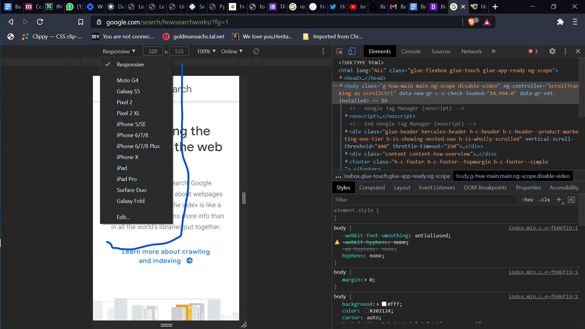
You can write media queries for 3 to 4 screens depending on the design or how the contents fit on the device
- CSS reads its code from top to bottom. Assuming you are writing code for three screens; 440px, 770px and 1150px.
First Instance
The code snippet below will display the 1150px screen first (laptop screen) then 770px (the tablet screen) and finally the 400px (the small screen).
@media only screen and (max-width: 1150px) {
    body{
        background-image: linear-gradient(to top, #F2C09D,#F5B88E, #FAAA37);
    }
    .top__bg{
        box-sizing: border-box;
        height: 35rem;
        margin-top: 10%;
        width: 62rem;
        background-color: white;
       margin-left: auto;
       margin-right: auto;
       box-shadow: 0 4px 7px rgba(0, 0, 0, 0.2);
       border-radius: 12px;
       overflow: hidden;
    }
}

/* 770px */

@media only screen and (max-width: 770px) {
    body{
    overflow: hidden;
        background-image: linear-gradient(180deg, #F2C09D,#F5B88E, #FAAA37);
    }
      .top__bg{
        box-sizing: border-box;
    height: 65vh;
    max-width: 100%;
        margin-top:30%;
        width: 80%;
        margin-left: auto;
        margin-right: auto;
        padding:50px 0 0 0;
        background-color: white;
       box-shadow: 0 4px 7px rgba(0, 0, 0, 0.2);
       border-radius: 12px;
      overflow: hidden;
    }
}

/* 440px */

@media only screen and (max-width: 440px) {

body{
    overflow: hidden;
    background-image: linear-gradient(180deg, #F2C09D,#F5B88E, #FAAA37);
}

.top__bg{
    box-sizing: border-box;
    height: 50vh;
max-width: 100%;
    margin-top:50%;
    margin-bottom: 40%;
    width: 60vh;
    margin-left: auto;
   margin-right: auto;
    background-color: white;
   box-shadow: 0 4px 7px rgba(0, 0, 0, 0.2);
   border-radius: 12px;
   overflow: hidden;
}
 }
Second Instance
The code snippet below will display the desktop view perfectly, but the mobile view will be scattered, in some cases, the mobile design may appear on the desktop layout.
@media only screen and (max-width: 440px) {
body{
    overflow: hidden;
    background-image: linear-gradient(180deg, #F2C09D,#F5B88E, #FAAA37);
}
.top__bg{
    box-sizing: border-box;
    height: 50vh;
max-width: 100%;
    margin-top:50%;
    margin-bottom: 40%;
    width: 60vh;
    margin-left: auto;
   margin-right: auto;
    background-color: white;
   box-shadow: 0 4px 7px rgba(0, 0, 0, 0.2);
   border-radius: 12px;
   overflow: hidden;
}
 }

/* 770px */

@media only screen and (max-width: 770px) {
    body{
    overflow: hidden;

   background-image: linear-gradient(180deg, #F2C09D,#F5B88E, #FAAA37);
    }
      .top__bg{
        box-sizing: border-box;
    height: 65vh;
    max-width: 100%;
        margin-top:30%;
        width: 80%;
        margin-left: auto;
        margin-right: auto;
        padding:50px 0 0 0;
        background-color: white;
       box-shadow: 0 4px 7px rgba(0, 0, 0, 0.2);
       border-radius: 12px;
      overflow: hidden;
    }
}
/* 1150px */
@media only screen and (max-width: 1150px) {
    body{
        background-image: linear-gradient(to top, #F2C09D,#F5B88E, #FAAA37);
    }
    .top__bg{
        box-sizing: border-box;
        height: 35rem;
        margin-top: 10%;
        width: 62rem;
        background-color: white;
       margin-left: auto;
       margin-right: auto;
       box-shadow: 0 4px 7px rgba(0, 0, 0, 0.2);
       border-radius: 12px;
       overflow: hidden;
    }
}
- On mobile, all the content has to be at the center of each device (unless the design you are working on says otherwise). One can use the following code block to align contents;
margin:0 auto;
/* or */
 display:flex; /* (A display of flex would mean the items would be displayed in a row) */
 align-items:center;
 justify-content-center;
Anyone that works will be fine, if none works then google "how to center a div".
When working with images, give the parent div a max-width of 100% or 100vw to give it full width on mobile, try to avoid fixed units like px when working on mobile.
When working on mobile design, one section at a time, you can decide to comment on the remaining sections in the HTML and work on the code Getting used to responsive design can be hectic and frustrating, it takes time and a lot of practice.
When working with texts, it better to give it a responsive unit like em or rem, same goes with button width in %.
Sometimes, when contents refuse to stay on a single line, you can give it a width in % and see how the output looks.
Working with margins and padding, [ margin: top right bottom left; ]
[ padding: top right bottom left; ]
These help in centering contents and images, they can be in any unit but on mobile, we should stick to %.
ALWAYS REMEMBER TO USE RESPONSIVE UNITS
When it comes to boxes on mobile, you create a div with a class name with empty contents, then you style from the CSS and give it a width in % or vw and height in vh(view height).
When it comes to each section, always give it a max-width of 100%, to centralize the components margin: 0 auto;(Check code block)
When the background of a section is a color, give it a height in vh, the width by default is 100%, and also give it a max-width of 100%.
When you have two items that are arranged side by side on desktop view when it comes to the mobile view it has to be aligned vertically and centralized. To achieve that ;
display:flex;
flex-direction:column;
margin:0 auto;
- Some screens can be stubborn, like 600px- you can write a separate code for the screen.
- When checking on for responsiveness on dev tools, it can be tricky - you should host the code and test it on different devices.
display:flex;
flex-direction:column;
margin:0 auto;
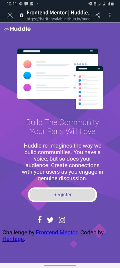
With all being said, I want to make a section responsive using frontend mentor huddle landing page
HTML Code block
<!DOCTYPE html>
<html lang="en">
<head>
<meta charset="UTF-8">
<meta name="viewport" content="width=device-width, initial-scale=1.0"> <!-- displays site properly based on user's device -->
<link rel="icon" type="image/png" sizes="32x32" href="./images/favicon-32x32.png">
<link rel="stylesheet" href="./style.css">
<link rel="stylesheet" href="https://cdnjs.cloudflare.com/ajax/libs/font-awesome/4.7.0/css/font-awesome.min.css">
<title>Frontend Mentor | Huddle landing page with single introductory section</title>
<!-- Feel free to remove these styles or customize in your own stylesheet 👍 -->
<!-- <style>
.attribution { font-size: 11px; text-align: center; }
.attribution a { color: hsl(228, 45%, 44%); }
</style> -->
</head>
<body>
<!-- Logo here-->
<div class="logo flex row">
<div class="logo img">
<img src="./images/logo.svg" class="logo" alt="logo">
</div>
</div>
<!-- Logo ends-->
<!-- Main section here -->
<header class="section flex row">
<div class="img">
<img src="./images/illustration-mockups.svg" class="illustration "alt="illustration-mockups">
</div>
<div class="content">
<h2>Build The Community Your Fans Will Love</h2>
<p>Huddle re-imagines the way we build communities. You have a voice, but so does your audience.
Create connections with your users as you engage in genuine discussion.
</p>
<button> Register</button>
</div>
</header>
<div class="icon ">
<i style="font-size:24px; color:white; margin-right: 1rem;" class="fa"></i>
<i style="font-size:24px; color:white; margin-right: 1rem;" class="fa"></i>
<i style="font-size:24px; color:white; margin-right: 1rem;" class="fa"></i>
</div>
<footer>
<p class="attribution">
Challenge by <a href="https://www.frontendmentor.io?ref=challenge" target="_blank">Frontend Mentor</a>.
Coded by <a href="#">Heritage</a>.
</p>
</footer>
</body>
</html>
CSS
*{
    @import url("https://fonts.google.com/specimen/Open+Sans");
    font-family: Open Sans ;
}
body{

    background: url(./images/bg-desktop.svg);
    background-size: cover;
    background-repeat: no-repeat;
    background-color: hsl(257, 40%, 49%);
}
.flex{
    display: flex;
}
.row{
    flex-direction: row;
}
.logo{
    max-width: 100%;
   width: 55%;
}
header{
    margin: auto;
    padding:40px;
    justify-content: space-around;
}
.illustration{
    max-width: 100%;
    width: 950px;
}
.content{
    color: white;
    margin-left: 4rem;
}
h2{
font-size: 35px;
font-weight: 700;
}
p{
font-size: 20px;
}
button{
    border: 4px solid white;
    width: 150px;
    padding: 10px;
    border-radius: 20px;
    font-size: 16px;
    color: hsl(257, 40%, 49%);
}
.icon{
    margin-left: 40rem;
    display: flex;

}


/*Mobile Screens */
@media only screen and (max-width:1440px){

}
@media only screen and (max-width:768px){
    header{
        padding: 45px;
        margin:auto;
    }
    .icon{
        margin-left: 50rem;
        margin-right: 30rem;
        display: flex;

    }
    .illustration{
        max-width: 100%;
        width: 1000px;
    }
}
@media only screen and (max-width:600px){
    .content{
        text-align: center;
    }
    body{

        background:url('./images/bg-mobile.svg');
        background-size: cover;
        background-repeat: no-repeat;
        background-color: hsl(257, 40%, 49%);
    }

    .illustration{
        max-width: 100%;
        width: 650px;
        margin-left: auto;
        margin-right:auto;
    }
.flex{
    display: flex;
    flex-direction: column;
}

    .icon{
        margin-left: 7rem;

        display: flex;
    }
    .content{
        align-items: center;
        justify-content: center;
         margin-left: 1rem;
    }

.logo{
    max-width: 100%;
   width: 63%;
}
    h2{
        font-size: 1.6rem;
        font-weight: 200;
    }
    p{
        font-size: 1.1rem;
    }
    button{
        width: 220px;
    }
}
@media only screen and (max-width:375px){
    .content{
        text-align: center;
    }
    body{

        background:url('./images/bg-mobile.svg');
        background-size: cover;
        background-repeat: no-repeat;
        background-color: hsl(257, 40%, 49%);
    }

    .illustration{
        max-width: 100%;
        width: 650px;
        margin-left: auto;
        margin-right:auto;
    }
.flex{
    display: flex;
    flex-direction: column;
}

    .icon{
        margin-left: 7rem;

        display: flex;
    }
    .content{
        align-items: center;
        justify-content: center;
         margin-left: 1rem;
    }

.logo{
    max-width: 100%;
   width: 63%;
}
    h2{
        font-size: 1.6rem;
        font-weight: 200;
    }
    p{
        font-size: 1.1rem;
    }
    button{
        width: 220px;
    }
}
Desktop view
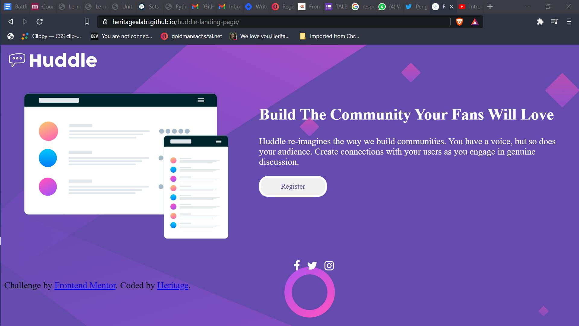
Mobile View
Having said all this, the knowledge of responsive design is really important to a web developer, it takes practice and time to improve on myself. You can always reach out to me on Twitter if you experience any challenge, or you want to make a contribution Thank you 💙