


Just like the way fairy godmother waved her wand and said “Bibbidi-Bobbidi-Boo”, Cinderella's tattered dress turned into a beautiful ball gown, an orange pumpkin turned into a cute white carriage, and many other things were transformed into beautiful objects. That is how CSS animations sprinkle magic on elements, texts, and images making them pretty, capturing users’ attention, and making a web page interactive.

CSS allows us to animate objects and components, causing text to change from one style to another and many other beautiful things without the use of javascript. We would be using pure CSS in this tutorial but keep in mind that there are various CSS animation libraries like animate.css, wicked CSS among others. We can also use Javascript to activate the magic of animations, but that requires libraries like animate.js
Here are a few terms you should know while starting with CSS Animation
- Animation-Duration: The animation-duration property is used to specify how long the animation cycle should take.
Animation-Name: The animation-name property is used to specify one or more names of animations defined by @keyframes rules, that are to be applied to the selected element.
- Animation-Timing-Function: The animation-timing-function specifies the speed curve of an animation. There are transitions that control the timing like ease-out, ease-in, linear.
- Animation Iteration Count: The animation-iteration-count property specifies the number of times an animation should be played.
Animation Delay: The Property defines when the animation will start.
Keyframes: A keyframe in animation is a drawing that defines the starting and ending points of any smooth transition. The keyframe style begins with a percentage ; from 0% to 100%.
Now that we are familiar with the terms above, there are cool stuff we can play around with. They include:
1. Twinkling objects
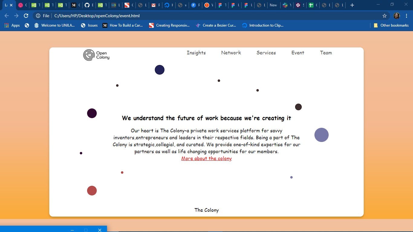
In the image above, we are going to animate the scattered circles around the text. Just as stars that twinkle in the sky, we would make the circle do the same. If you want to give it a shot, you can make the shapes an actual star, CSS clip path would take care of it. You can check my previous article - Drawing shapes with background clip path. In the class or id of the shape in the html, you target it here in the CSS.
HTML Code
<section>
<div class="circle one"></div>
<div class="circle two"></div>
<div class="circle three"></div>
</section>
CSS code
.circle{
animation-iteration-count:infinite;
/**  For something to be infinite, it means bouncing non-stop. **/
}

/** i want the circles to be different sizes, i would fill in the remaining styles there. **/

section{
  margin-top:2rem;
  display:flex;
  justify-content:space-around;
}
.one{
width:80px;
  height:80px;
/* i gave the animation a name of twinkle-1 */
animation-name: twinkle-1;
    animation-duration: 1.5s;
       animation-timing-function: linear,ease-in,ease-out;

}
.two{
width:40px;
  height:40px;
/* i gave the animation a name of twinkle-2 */
  animation-name: twinkle-2;
    animation-duration: 1.5s;

}
.three{
width:60px;
  height:60px;
  animation-name: twinkle-1;
    animation-duration: 3s;

}
/* The percentages in keyframes represent a percentage of the animation duration */

@keyframes twinkle-1 {
    20% {
       transform: scale(0.5);
      opacity: 0.5;
    }
  }
/* scale() : defines the transformation that resizes an object, it can be bigger or smaller.
*/

/* opacity: is how images/objects, disappear or reappear. It is within the range of 1.0(full visibility) and 0(not visible). */

  @keyframes twinkle-2 {
    20% {
      transform: scale(0.5);
      opacity: 0.5;
    }
  }
}
The output should look like the demo below;
2. Bouncing objects
We can make objects bounce and return to their original positions using CSS animations. This can be achieved by increasing the width and defining values for the top property between percentage frames
HTML Code
<section>
<div id="ball"></div>
<div id="ball"></div>
</section>
CSS Code
/* here i gave the balls  the same animation name, they follow the styling property in the keyframes */

  #ball {
    width: 100px;
    height: 100px;
    margin: 50px auto;
    position: relative;
    border-radius: 50%;
    background: blue;
    animation-name: bounce;
    animation-duration: 4s;
    animation-iteration-count:5;
  }

  @keyframes bounce{
    0% {
      top: 0px;
    }
    50% {
      top: 20px;
      width: 40px;
      height: 40px;
    }
    100% {
      top: 0px;
    }
  }
The demo should look like the output below
The uses of CSS animations are limitless, but for the scope of this post we would only be looking at the basics. To learn more you could check out: